7 Design Mistakes To Avoid In Your Home
We have been talking about moving for the past 2 years – to move or to not? Well we have recently decided to stay in our current home and add on 1,400 sq. feet! While we were still thinking about moving, we would look through tons of homes on Zillow. Some homes were well staged and thought out, but there were some homes that had easily avoidable design mistakes that I couldn’t stop looking at! I decided to compile a list of what I noticed – along with some simple fixes for these “what not to do’s” in your own home.
What Not To Do In Your Home
1. Buying furniture sets!
Please don’t buy a 5 piece bedroom set or use the throw pillows that come with your sofa. A sign of good design is blending pieces from a variety of stores, a variety of prices, and mixing materials, tones, and colors. Do keep to the same color palette and keep the style of your pieces consistent throughout your home.
2. Hanging the wrong curtains.
A common design mistake I see are curtains that are hung too high. There should not be a 1 foot gap between the floor and the curtains! I always recommend hanging curtains high and wide and they should just kiss the floor.
3. Rugs are not large enough.
This design error may be just as common as the curtain debacle. At least the front legs of all your furniture should rest on your rug. If you can fit all your furniture legs, thats great! Its not necessary but its harder to find a rug thats too big than too small. I have a free installation guide to help you select the right size rug!
4. Too much clutter on tabletops.
I think sometimes its easy to overwhelm your surfaces when you’re trying to figure out how to style your space. Sometimes more is more, but not to the point where someone may question whether or not you’re hosting a garage sale in your living room.
5. My biggest pet peeve…TV’s hung way too high.
If you are doubting whether you’re making this design mistake, download this free installation guide here. This isn’t just a design issue but a health issue. Protect your necks people!
6. Furniture is not to scale.
It’s important to place furniture that is the correct scale to the room in your home. Height of your walls, square footage, and size of windows all play into how large your furniture should be. If your space is smaller then your furniture is going to be on the smaller size too. Don’t try to fit your oversized sectional into a small living room…buy accordingly and don’t forget to measure! The grander your ceilings and space, the larger the furniture/decor/art you’ll probably need.
7. A color palette that doesn’t go together.
If you’re a girl who loves color, embrace that. But stick within a color palette of 3-4 colors instead of having a wild free for all. When choosing colors consider how you want to feel within your home. What mood do you want to set when people enter your home? Tapping into those feelings will help steer you in the right direction.
If you would like help avoiding these design mistakes or styling your space you can contact us here or start a chat in the sidebar to the right!
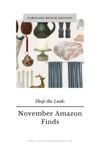
November Amazon Finds
Finding Amazon decor and furniture each month is one of my favorite things to do! There’s an endless amount of items and I love to
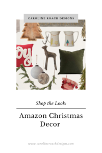
Amazon Christmas
Finding Amazon decor and furniture each month is one of my favorite things to do! There’s an endless amount of items and I love to
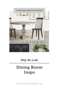
Dining Room November Inspo
Dining Room Inspo I love cozy dining rooms. Warm tones, cozy area rugs, and plush drapes can take a cold space and make it a
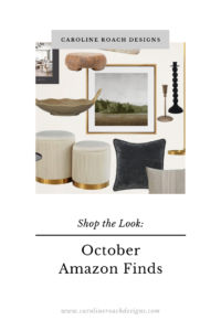
October Amazon Finds
Im really coming in hot here on the last day of October to share with you my Amazon finds for this month! I have yet
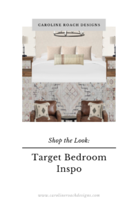
The Fall Edit: Target Bedroom
Target Bedroom Inspo Decorating your home for fall doesn’t need to scream pumpkin, leaves, cheesy sayings on throw pillows, or even “fall colors”. It can
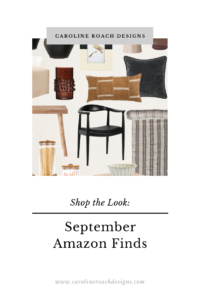
September Amazon Finds
JavaScript is currently disabled in this browser. Reactivate it to view this content. For the month of September I’ve included a bonus board for my
